In video games, the first impression usually isn’t your combat system or your dialogue—it’s your visuals. A player sees a thumbnail on a store page, a banner in a community post, a patch announcement on social media, or a poster on an event listing, and they decide in seconds whether to care. That’s why game posters and key art matter even for small teams. They’re not just “pretty images.” They’re a shortcut to mood, genre, and trust.
I’ve learned this the hard way while helping put together promo materials for game updates and small releases: even a great screenshot can look messy when you try to turn it into a poster. UI elements distract. Lighting is inconsistent. Characters blend into the background. And the moment you add text, everything feels cramped.
What worked was having a repeatable workflow: take real in-game stuff, clean it, make it readable and then build a poster around one clear message. There are tools to speed that process up, obviously—but the end result still requires a human eye, particularly in games where style and tone are everything. So the process of turning real gameplay moments into posters that looked intentional and readable, and “game-world accurate” enough, never involves some off-the-shelf template or robot design irresponsibility.
What a “Good” Game Poster Does in One Glance
A strong game poster answers three questions immediately:
First: what genre or vibe is this? Horror, cozy, tactical, arcade-fast—players should feel it instantly.
Second: what am I looking at? A character, a location, a monster, a vehicle, a moment of action—there should be one clear focal point.
Third: why should I care right now? A new update, a launch date, an event, a season, a challenge mode—one message, not five.
If any of these are unclear, your poster becomes background noise. And in gaming spaces, background noise dies fast.
Start With Real Gameplay (Because Authenticity Is a Style)
The easiest way to lose trust is to show art that doesn’t match the actual game. Players notice. Even if you are making spec work for a cinematic poster, nailing the look and feel of actual play helps get the tone right – especially for indie teams where your community is up in your grill with expectations.
Pick a starting image from one of these sources:
A high-resolution screenshot from a dramatic moment (boss encounter, intense traversal, iconic environment).
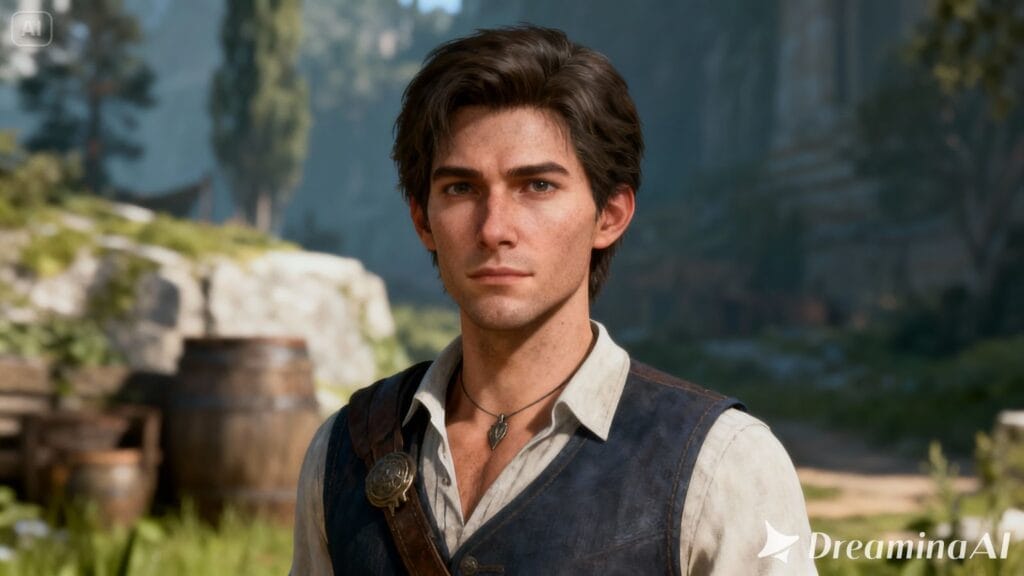
A clean character pose captured in a quiet scene where UI can be hidden.
A strong environmental shot with depth—foreground, midground, background—so text has space to live.
If your game has heavy UI, capture a version with HUD disabled if possible. If you can’t disable it, choose a moment where the UI doesn’t overlap your subject.
Clean the Image Without Erasing the Game’s Identity
The “clean up” stage is not about making the image look like a different game. It’s about removing distractions so the viewer understands what matters.
This is where a tool like Dreamina can be useful—but the important part is how you use it. You’re not trying to repaint your art direction; you’re trying to focus it.
When I clean up a screenshot, I usually do three things:
Remove small clutter (floating icons, stray effects, UI fragments, text remnants).
Separate the subject from the background so the character or key object reads clearly.
Create breathing room where a headline can sit without covering the most interesting detail.
Here’s where an editor workflow might look like this, if you were trying to run through it quickly: start with your image, address distractions first and then adjust color and clarity. If you want a fast path for that editing step, you can use an AI image editor as long as you keep the result consistent with the game’s real look and lighting.
Enhance for Readability (Because Posters Are Seen Small)
Most game posters are viewed on a phone first. Even if you design at a large size, your audience will see it compressed into a feed. That’s why readability beats micro-detail.
Enhancing doesn’t mean cranking the sharpness until everything looks crunchy. It means controlling contrast and clarity so the subject stays readable when scaled down.
A good enhancement pass typically aims for:
Slightly lifted shadows so dark scenes still show shape.
Controlled highlights so bright effects don’t blow out.
Moderate detail recovery so textures look intentional, not noisy.
If your base screenshot is slightly soft (which often happens with motion blur, dynamic lighting or compression), a focused tool can assist. For instance, a photo enhancer may provide you with a cleaner base—but be sure to inspect the output closely, particularly for faces, texture patterns and UI edges where artifacts can crop up.
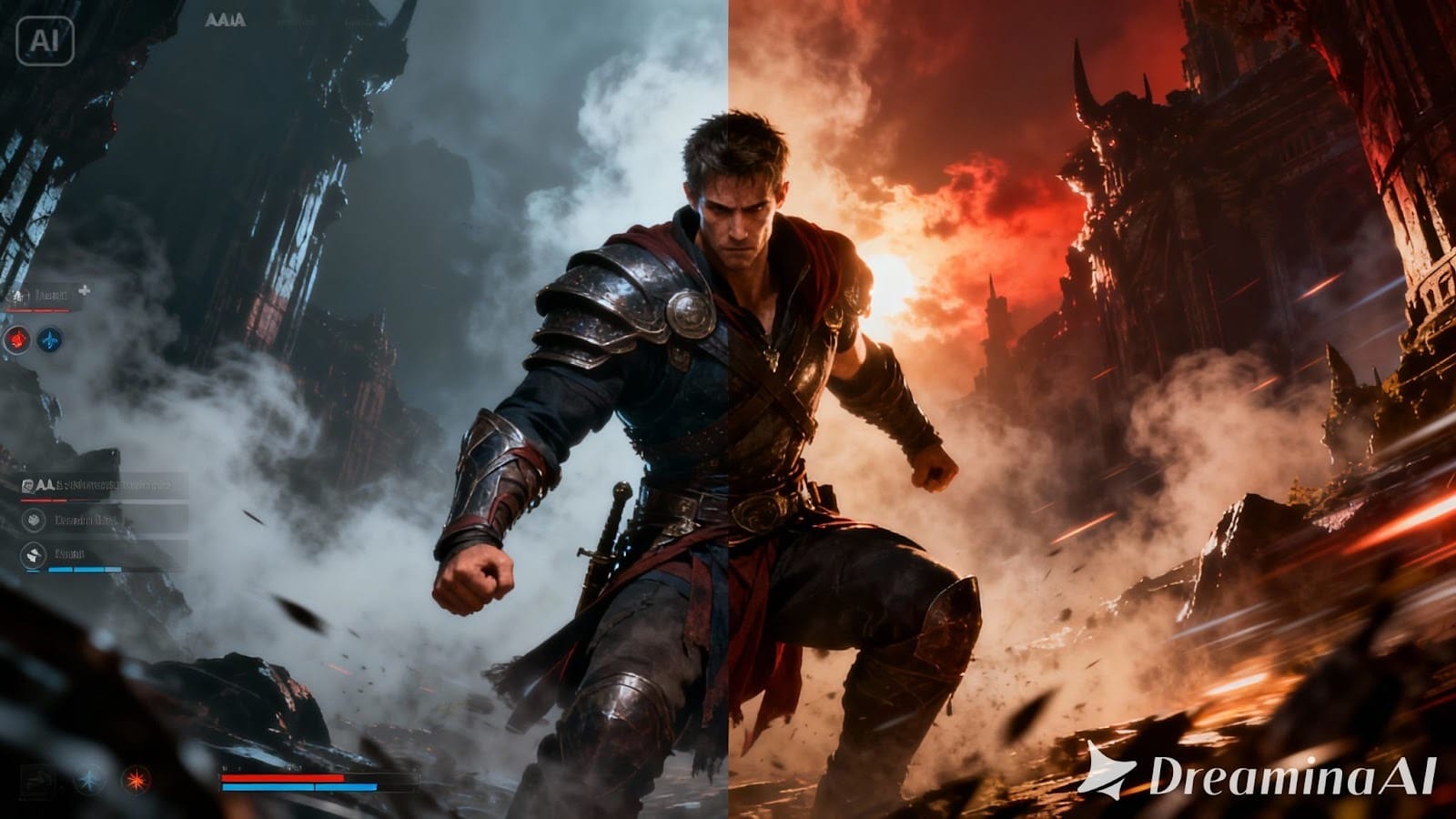
Design the Poster Around One Message
Game posters fail when they try to do too much. One poster should push one action:
Wishlist now.
New update live.
Season begins.
Demo available.
Tournament this weekend.
If you want to share multiple points (patch notes, features, modes), do it as a carousel or a follow-up post, not all on one image.
When you add text, keep it minimal and intentional. I like to structure it as:
A short headline (3–7 words).
A supporting line (optional) that clarifies what’s happening.
A small footer line with the key detail (date, platform, version number), if needed.
You should also respect negative space. If your image is full of action everywhere, you’ll fight for legibility. In which case, it’s better to blur or darken one side slightly than shrink text until even the most keen-eyed readers can’t make it out.
When you’re ready to turn your edited image into a full poster composition—background, layout, typography, and export—use a dedicated poster workflow. One option is to generate posters from your game visuals, then refine the final layout so it feels custom to your title rather than generic.
Keep It “Game-Accurate” (Avoiding the Generic Promo Look)
Gaming audiences are sensitive to fake polish. If your poster looks like stock art, it can hurt more than it helps. The goal is a poster that feels like it came from the world of your game.
A few subtle choices help:
Use colors already present in your game’s palette.
Let lighting direction stay consistent (don’t brighten shadows in a way that breaks the scene).
Avoid over-smoothing textures that are part of your style (pixel art, painterly strokes, gritty surfaces).
If your game is cozy, leave some softness. If it’s tactical and sharp, keep edges clean and contrasts strong.
This is also where brand mentions matter. In a published article, it’s enough to reference Dreamina briefly as the tool used for cleanup and poster construction, without turning the piece into an advertisement. Mention it only where it genuinely explains the workflow, and let the results carry the credibility.
Device Compatibility for a Practical Workflow
For creators, portability matters. You might capture screenshots on a PC, review drafts on a phone, and finalize assets on the web. Dreamina’s workflow is designed to be accessible across common terminals like PC and web, so you can move between devices without rebuilding the project from scratch. That cross-device flexibility is useful when you’re iterating on poster variants for different game announcements.
A Simple Quality Check Before You Post
Before publishing, do a quick human test:
Zoom out until the poster is the size of a phone thumbnail. Can you still tell what the game is?
Can you read the headline without effort?
Is the focal point obvious, or does your eye wander?
Do the colors and lighting still feel like your game?
If the answer is “mostly,” you’re close. If the answer is “not really,” simplify: reduce text, increase contrast around the subject, or choose a cleaner base screenshot.
Closing Thought: Posters Are Part of the Game, Not Just Marketing
A great game poster doesn’t feel like an ad. It feels like you’re being invited somewhere. If you construct your posters from genuine gameplay, clean them up carefully, optimize for readability and base them around one clear message, you get visuals that players can trust — and actually click.
When applied strategically, judiciously and with purpose, though, Dreamina can help deploy such tools: edit, enhance, arrange. But what the poster does that’s good is still a human judgement thing – knowing what your game actually is and what it is that your players care about and what really ought to be the very first shit they see.